The Making of Our New Visual Identity

Once we had a name for the company, it was time to come up with the main parts of our visual identity: our logo, fonts, and colors that set us apart. We're familiar with working from guidelines to produce on-brand content, so we know the ingredients and the impact it has. This was a chance to express our story that in itself involves telling others' stories. So, we didn't want to be overwhelming with our visual presence. Our branding needed to reflect some of the seams of our storytelling process. We wanted to make our visual presence feel like a glimpse of those nocturnal creative gears that often spin through the night, starting aimlessly as pieces of ideas and resolving into meaning through action.
So, we set out to do all of the branding ourselves.

Creating the Logo
We wanted the logo to be as simple as possible while communicating a sense of storytelling resolution, as well as a bit of the workshop creative style, in a way that's just abstract enough to not force any meaning on its own. Crafting a logo is one case when the overthinking should all be behind the scenes while the logo itself is incredibly simplistic. That said, more thinking went into it than it might appear just from looking at it now...

What's the hexagon for? The number six means a lot to us at the intersection of art and science. The six main stages of the scientific method (question, hypothesis, procedure, data, result, conclusion) can be applied to any creative project, as long as it involves a bit of experimentation. This is the basis for our creative thinking. You start with a concept of what you're going to make, then you come up with possibilities on how to do it and what it will look like. Next you follow a plan to make it happen, and in doing so, collect original data (audio/visual information). The data is massaged into a result, or a final product. Finally, the observations you make about the result and its real-world impact are the conclusion of the product. This is the basic framework we apply to every project, so we sought to have this reflected in the logo. Also, importantly, the element of carbon, the basis of life on Earth, is the sixth element on the periodic table with six protons. It shares properties with silicon, the basis of computer circuits: they each have four outer electrons allowing for elaborate molecular compounds. We started the design with a hexagon.

Next, the cutout of the square was added to give the logo a sense of completion, or the resolution that a project is heading towards until it's finished. The square represents a finished piece, like the rectangular view of an image or video, or in mathematics the tombstone symbol that signifies that something has been mathematically proven. So, the logo as an inward motion represents the nebula of a creative process evolving into the completed product. It also gives the hexagon a look that evokes a memory of old East Asian coinage: a sense of weight and value.

Tilting the hexagon by 15 degrees puts the shape into motion. The tilt breaks up all parallel lines from the square, which creates less predictable angles within the positive space of the logo. With this weight and motion we gained momentum. Our logo became the first spinning gear in our workshop.
At the end of the day, yes, it's just a square inside of a hexagon. Not a big deal. But they say that trigonometry is the study of a triangle trapped inside of a circle, and that helped put a dude on the moon.
Choosing our Fonts
Contrast and duality became clear themes in our identity. So, in choosing fonts it made sense to look at two ends of the typographic spectrum: the rounded sans serif, and the hard edges of a slab font.

We arrived on our two main picks for the logo wordmark: Arcon Rounded, and Carton. Arcon Rounded is an awesome free font designed by Martin Zarth. It's free for commercial use (though we donated a bit to support the designer). Its rounded edges make it soft on the eyes. The clarity in these shapes call attention to its visual resolution: those curved nodes work well against the pixel limitations of the screen it's being viewed on. Carton is a timeless looking slab-serif font created by Nick McCosker. Its commercial license is very modest, and the typeface has a classic, humble look. This works great for the word "workshop" as it adds a tactility and friendliness to our look. It makes it feel like the Resolution Workshop is a cool place to be.
A Different Approach to Color Pallet
We thought right away: what if we don't actually have a brand color, but instead embrace a spectrum?
We designed a modified version of the color wheel that blends together the six main colors of the rainbow: red, yellow, green, cyan, blue and magenta. (These six colors happen to match the six points of the hexagon.) We fine-tuned the placement of the colors to bring forward the purple and indigo hues, and remove emphasis from its opposite, yellow. Those deep blues convey the nebulous early stages of a project, where infinite possibilities lie. Using a gradient as our color identity means that we don't have a singular hue that represents us: rather, we work with brands that use all different colors themselves.
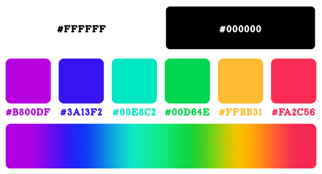
Since one of our main themes is contrast, we thought we'd use pure black and pure white to supplement the custom color spectrum.
Why settle for super-dark grey & almost-white white? We began to translate that to our use of fonts and shapes, like on this site. Using a white backdrop and black text would have been the safer route. That's how any news site presents articles, it's how text is printed on paper, and it's the default for any HTML site. But the black background is one way of letting our works stand out on their own. We chose black as a dominant color for the same reason why crew members of a theater production wear black as they're moving around set decoration: to hide the magic in the shadows, and let the scene speak for itself.
We have yet to fully define our new creative style, but we have a handle on our process. Our logo, wordmark and approach to color are made to represent the framework that guides us through each project. Simply put, our identity as a media shop is made to be a backdrop for our works.
